Fix highlight colors for QT apps on a GTK desktop
I’m using the i3 window manger. As smart as possible, increases productivity, and feels clean. Exactly how I like my desktop. I’m still very happy that Uschy hinted me towards i3!
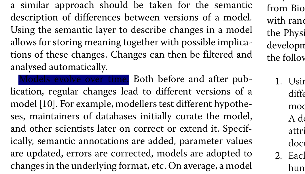
However, I’m experiencing a problem with highlighted text in Okular, my preferred PDF viewer. When I highlight something in Okular the highlight-color (blue) is far too dark, the highlighted text isn’t readable anymore. I used to live with that, but it was quite annoying. Especially when you’re in a meeting/presentation and you want to highlight something at the projector. I just saw that problem occurring in Okular. Not sure why, but I honestly do not understand this whole desktop config thing – probably one of the reasons why I love i3 ;-)
Today, I eventually digged into the issue and found out what’s the problem how to solve the problem.
Apparently, Okular uses a Qt configuration, that can be modified using the qtconfig tool.
Just install it (here for Qt4 applications):
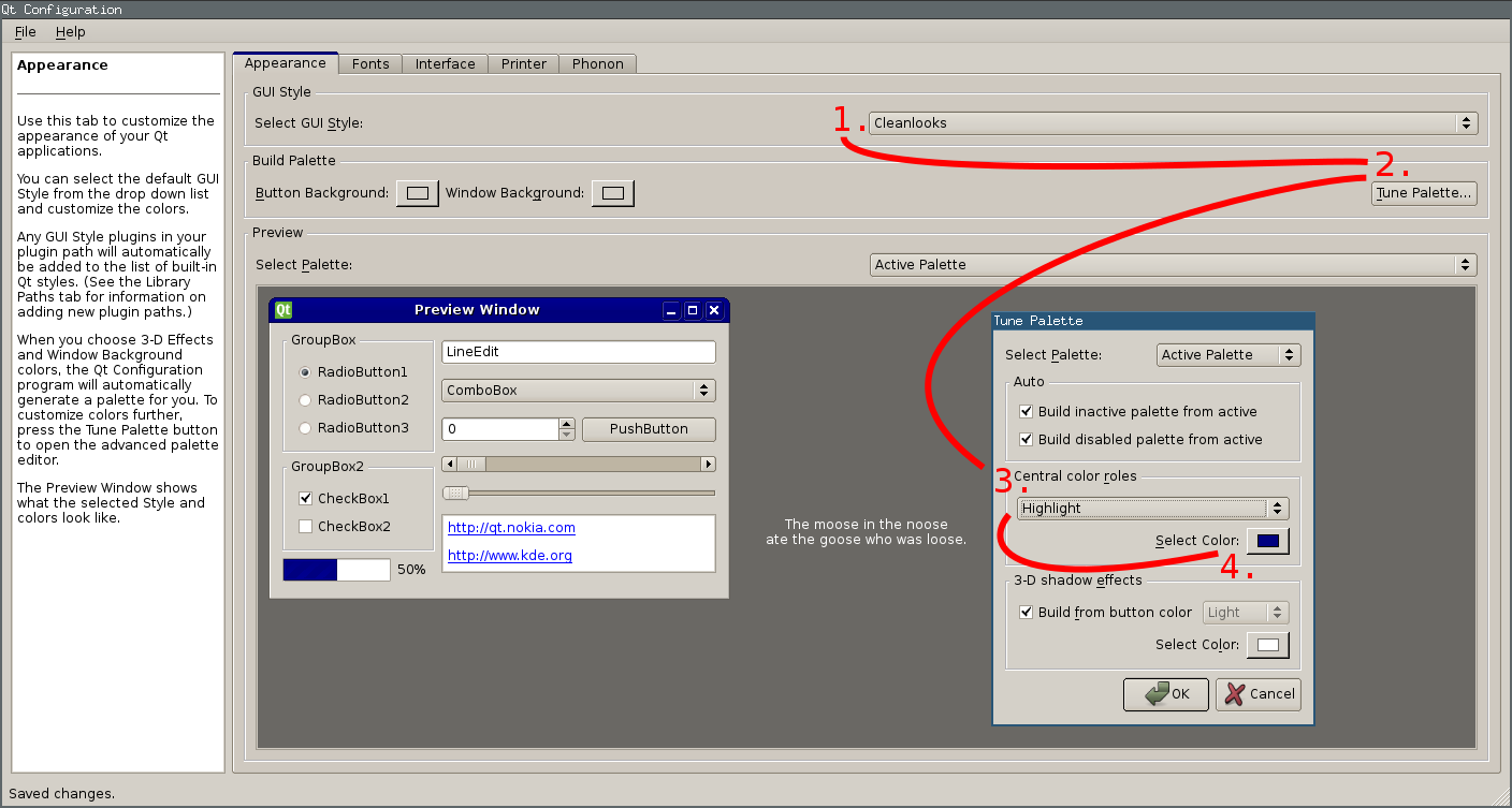
aptitude install qt4-qtconfigWhen you run qt4-qtconfig a window will pop up, as you can see in the figure on the right:
- Select a GUI Style that is not Desktop Settings (Default), e.g. Cleanlooks.
- Then you can click the Tune Palette… button in the Build Palette section.
- A second window will pop up. Select Highlight in the Central color roles section.
- Finally you’re good to select the hightlight color using the color chooser button! :)
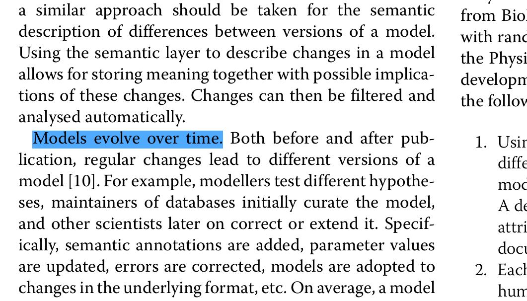
Was a bit difficult to find, but the result is worth it! The figure on the bottom shows the new highlight color – much better.
I will probably never understand all these KDE, QT, Gnome, GTK, blah settings. Every environment does it differently and changes the configuration format and location like every few months. At least for me that’s quite frustrating…
- config (22) ,
- fix (13) ,
- media (61) ,
- okular (3) ,
- pdf (3) ,
- private (31) ,
- trick (61) ,
- userinteraction (30) ,
- x (8)


Leave a comment
There are multiple options to leave a comment: