Stretching @YOKOFAKUN
I’m following Pierre Lindenbaum both on twitter and on his blog. I love his projects, but I don’t like the layout of his blog, so I created a user-script to make the style more comfortable.
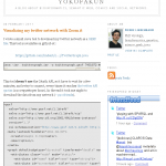
The problem is the width of his articles. The content is only about 400 pixel. Since Pierre often blogs about programming projects his articles are very code-heavy, but lines of code are usually very long and word-wrap isn’t appropriate in this case. So you have to scroll a lot to get the essential elements of his programs, see figure 1 as example from the article Visualizing my twitter network with Zoom.it.
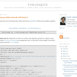
The Firefox extension Greasemonkey comes to help. As you might know, with this extension you can easily apply additional JavaScript to some websites. So I created a so called user-script to stretch his blog. By default the main content is stretched by 200 pixel, so it’s about 1.5 times wider, see figure 2.
The code:
// ==UserScript==
// @name           YOKOFAKUN stretcher
// @namespace      binfalse.de
// @description    stretch the content on plindenbaum.blogspot.com
// @include        *plindenbaum.blogspot.com/*
// ==/UserScript==

var stretchPixels = 200;
var removeFriendFeed = false;
var toChange = new Array ("header-wrapper", "outer-wrapper", "main-wrapper");


// thats it, don't change anything below
// unless you know what you're doing!


function addCSS (css)
{
  var head = document.getElementsByTagName ('head') [0];
  if (!head)
    return;
  var add = document.createElement ('style');
  add.type = 'text/css';
  add.innerHTML = css;
  head.appendChild (add);
}

for (var i = 0; i < toChange.length; i++)
{
  var element = document.getElementById (toChange[i]);
  if (!element)
    continue;
  var org = parseInt (document.defaultView.getComputedStyle(element, null).getPropertyValue("width"));
  if (!org)
    continue;
  addCSS ('#' + toChange[i] + '{width: ' + (org + stretchPixels) + 'px}');
}

if (removeFriendFeed)
{
  var friendfeed = document.getElementById ('HTML3');
  if (friendfeed) friendfeed.parentNode.removeChild (friendfeed);
}
I also added a small feature to hide the friendfeed widget, I don’t like it ;-)
If you have installed Greasemonkey you just have to click the download-link below and Greasemonkey will ask if you want to install the script. To stretch the site by more/less pixel just change the content of the first variable to match your display preferences. If you set removeFriendFeed to true the friendfeed widget will disappear.
So far, have fun with his articles!
- bioinformatics (22) ,
- firefox (14) ,
- media (61) ,
- programming (75) ,
- trick (61) ,
- twitter (9) ,
- userinteraction (30) ,
- userscript (6)
Leave a comment
There are multiple options to leave a comment:
- send me an email
- submit a comment through the feedback page (anonymously via TOR)
- Fork this repo at GitHub, add your comment to the _data/comments directory and send me a pull request
- Fill the following form and Staticman will automagically create a pull request for you:


1 comment
Thank you for that useful script. I should use it too :-)