Compress Google's Reader
If you are using Google’s Reader to aggregate news feeds you might have recognized that Google re-engineered its feed-reader to fit into the styles of other Google-services.
The new interface slimmed a bit and is more lightweight, but I’m arguing about the large white-spaces! Too much space is unused and to less information is presented. Such disadvantages are also discussed at other places.
First I thought I’ll get used to it, but now I decided to change it on my own. So I created a small user script for the Firefox extension Greasemonkey. Here you see the difference (click the images for larger versions):
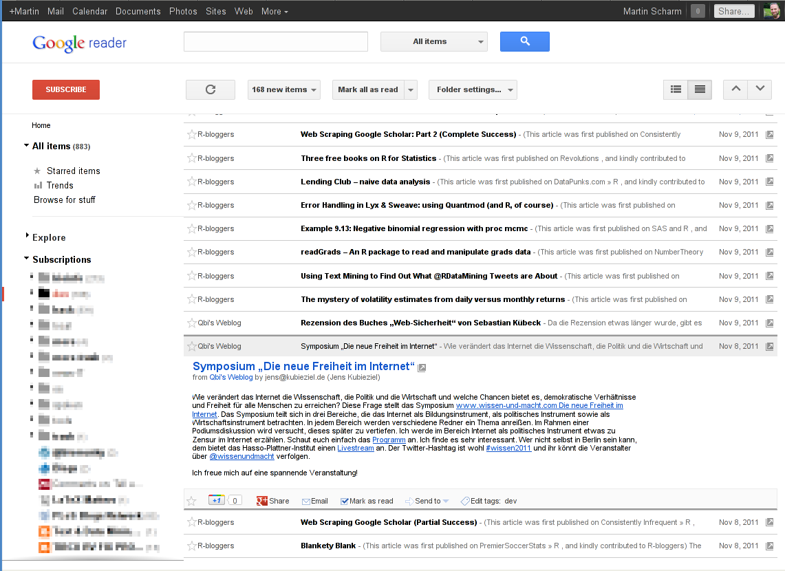
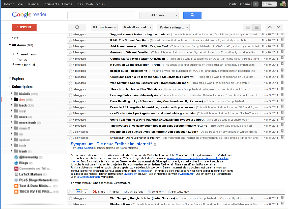
So you see, there is less space at the top of the page and single entries got closer together. The script is available in the download section, all you need is the browser Firefox and its extension Greasemonkey. If you have both installed just click the following link to the download and Greasemonky will ask you to install my short script. That’s it for the moment ;-)
Update 22.11.2011: Updated the UserScript to support googles new layout.
- css (1) ,
- firefox (14) ,
- google (14) ,
- iceweasel (7) ,
- media (61) ,
- network (81) ,
- programming (75) ,
- trick (61) ,
- userscript (6)

Martin Scharm
Leave a comment
There are multiple options to leave a comment:
- send me an email
- submit a comment through the feedback page (anonymously via TOR)
- Fork this repo at GitHub, add your comment to the _data/comments directory and send me a pull request
- Fill the following form and Staticman will automagically create a pull request for you:
4 comments
How is this related to R?!?!
Sorry, my fault, just removed the tag. Thanks for the pointer!
Thanks :)
Cheers, Tal
Great! Works in Google Chrome as well.